Unionville: The Primary Ensuite & Closet
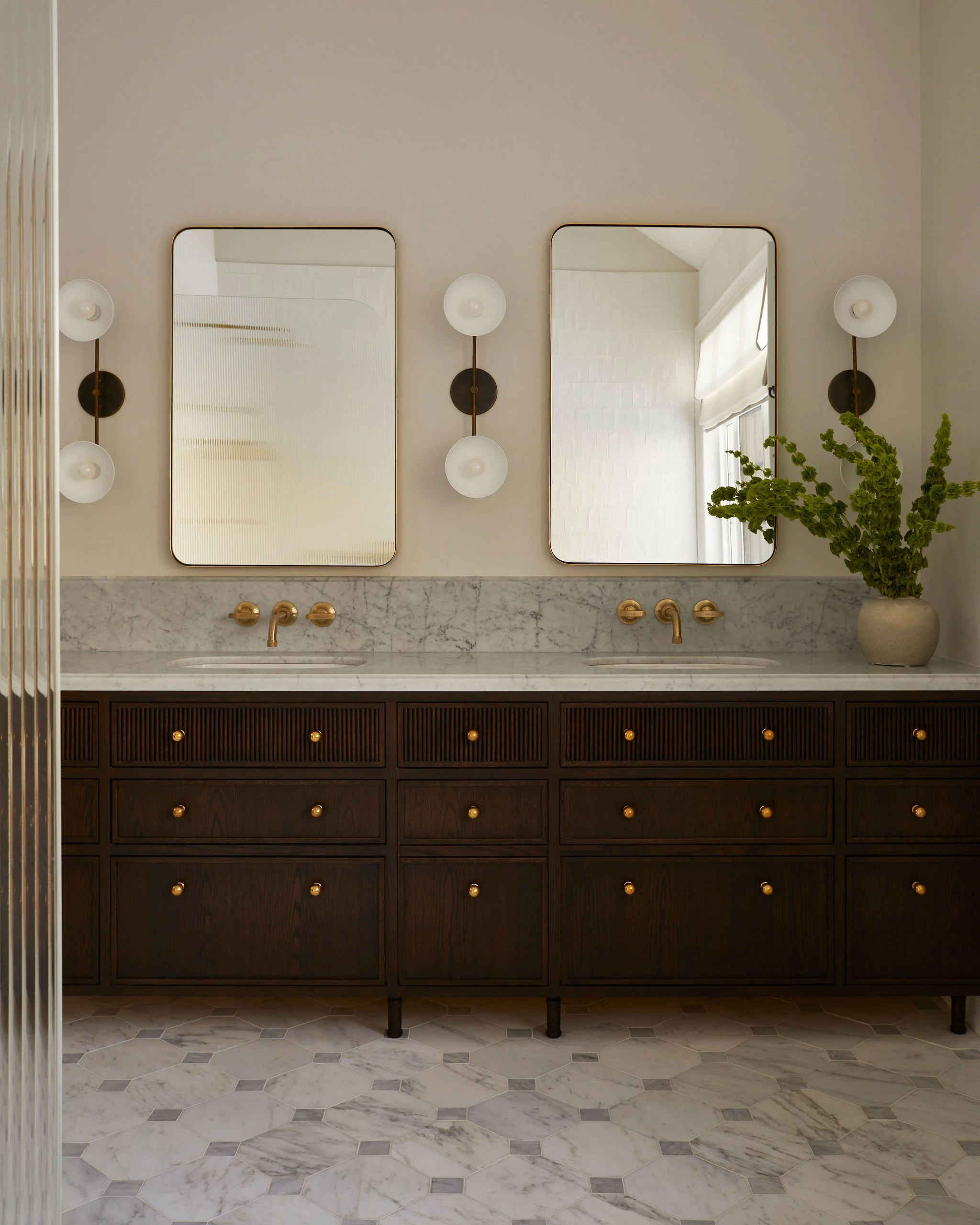
Photo: Niamh Barry
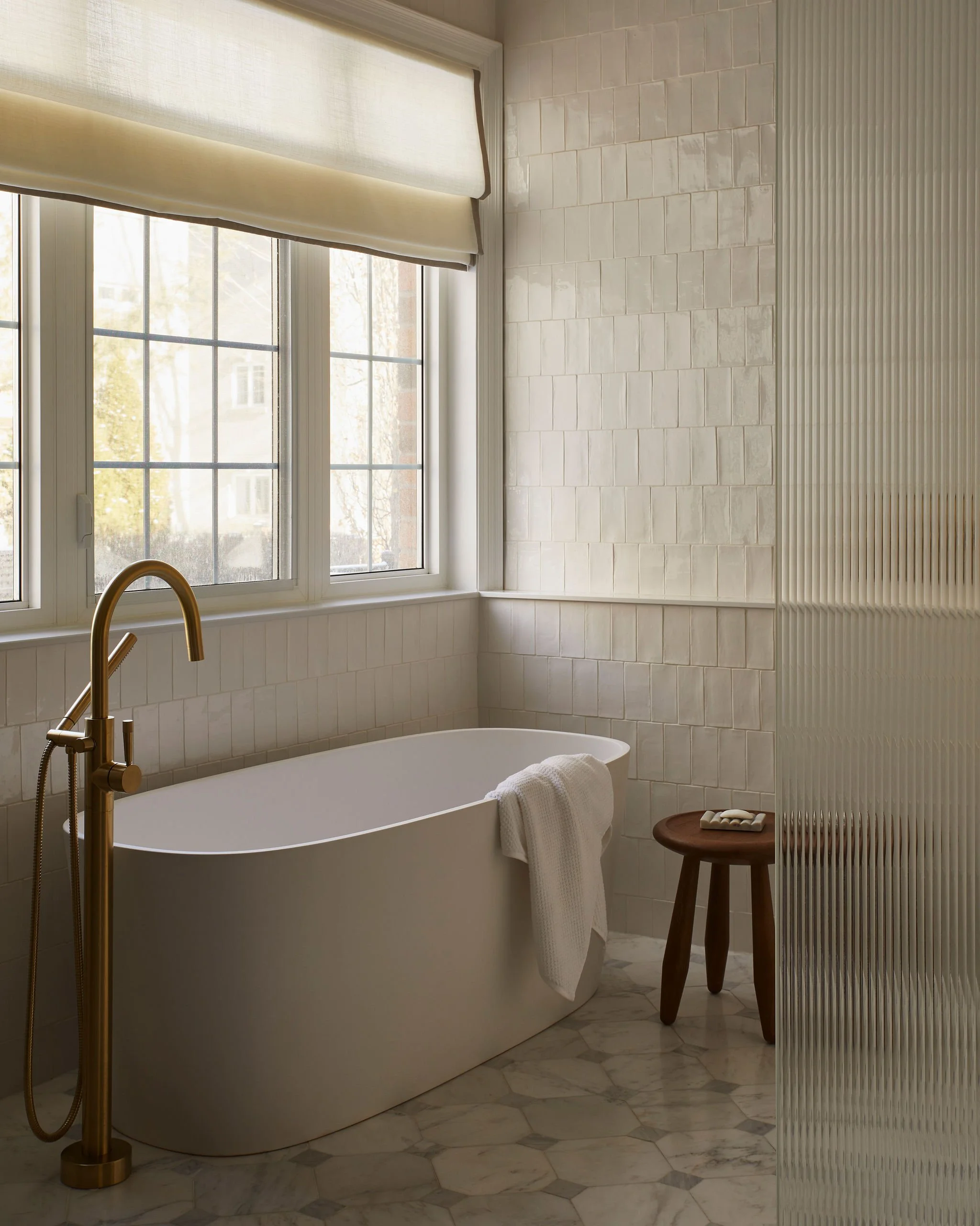
Photo: Niamh Barry
Every primary ensuite project starts the same way - with a wishlist. How many sinks? A freestanding tub or just a shower? Separate water closet? How much storage? These questions set the parameters, and from there our job is to figure out how to tick as many boxes as possible within the reality of the existing footprint.
This project was no exception:
A wet room
A double vanity
A water closet
Heated floors
And at the very top of the list - an epic walk-in closet for someone with a serious collection of clothes and shoes who wanted to see all of it, organized like a boutique, open to the bathroom
Classic, elegant, bright, and airy. That was the brief.
What we were working with was a different story.
The Before
The existing ensuite had good bones buried under a layout that wasn't working:
The vanity wrapped awkwardly around a corner, wasting space and creating an uncomfortable flow
The freestanding tub sat at an angle that felt like a missed opportunity
A separate toilet and bidet took up more room than necessary in the water closet
And the finishes, while grand in their time, had dated significantly
The footprint itself wasn't the problem. It was everything happening inside it.
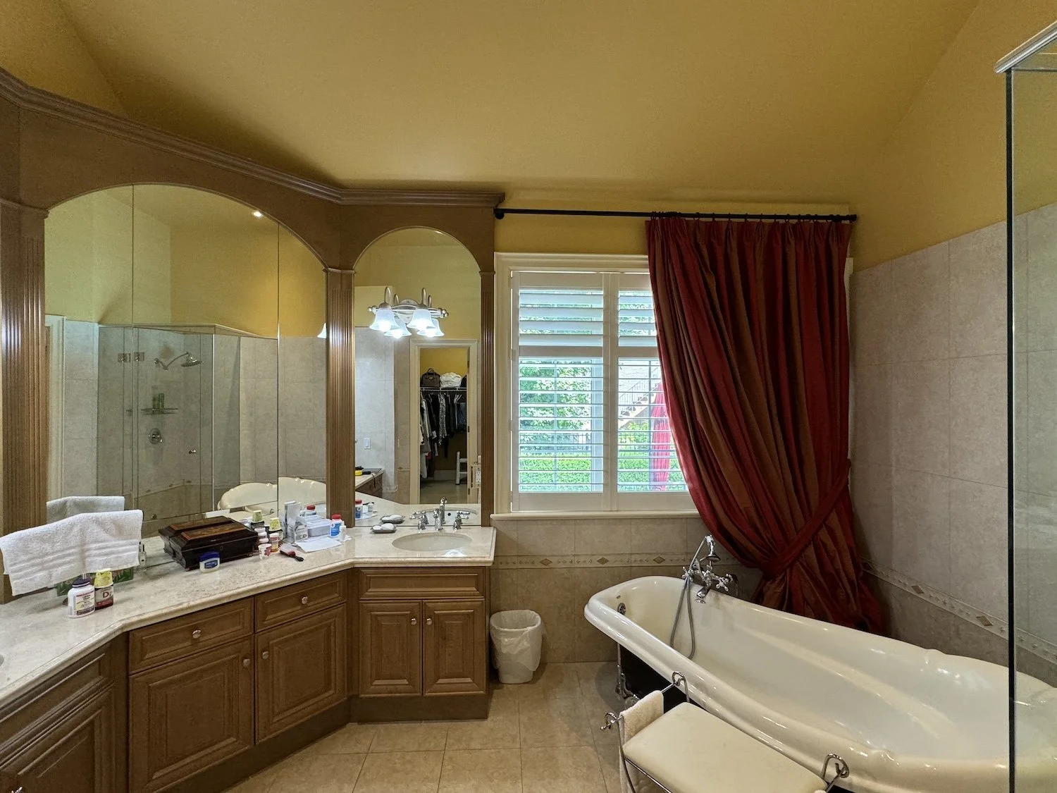
Before: the corner vanity and angled freestanding tub, before the layout was reworked.
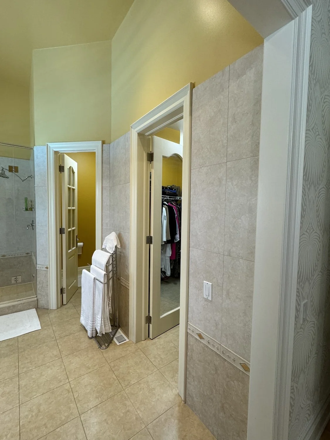
Before: the separate toilet and closet doors that once carved up the footprint.
The Layout
We started where we always do - with the floor plan.
The goal was to work within the existing combined bathroom and closet footprint while completely rethinking how the space was organized. Our client wanted to enter the closet through the bathroom, the two spaces connected but with a sense of separation - open concept in feel, distinct in function.
We smoothed out the awkward angles throughout, which immediately made the space feel larger and more intentional
The vanity was repositioned to run cleanly along one wall, giving us the generous double sink our client wanted without the wasted corner
The tub moved to the window - the natural landing spot, and the one that makes the most of the light
The water closet was consolidated to a single smart toilet, freeing up meaningful square footage
One detail that shaped the layout from early on: there would be a sightline from the bedroom into this space, which meant the view from the bed needed to be considered as carefully as the layout itself. That sightline was a big part of why we introduced the reeded glass feature - more on that shortly.
The demolition plan: full tile removal, old doors out, and framing in for a new pocket door.
The new floor plan: vanity along one wall, tub moved to the window, and the old toilet and bidet consolidated into a single water closet.
The Tile Story
Finish selection in a primary ensuite is always a balance between personal taste and longevity. Our client wanted something that felt elegant and elevated - and that fit within the broader aesthetic of her home, which leaned traditional and transitional. The finishes needed to feel like they belonged, not like they had been renovated in.
Early in the process we considered a checkerboard floor tile. It's a strong look - but it could read as a moment in time. The diamond pattern we ultimately chose does something similar visually while feeling significantly more classic.
We carried the floor tile into a continuous ledge running along the full length of the shower and tub wall - a detail that solved two problems at once. It eliminated the need for a separate shower niche and a separate tub surround ledge, creating one clean uninterrupted line that services both. Practical decisions made to look effortless.
Photo: Niamh Barry
The Wet Room
The shower is generous, open, and designed around how our client actually uses it.
An MCD signature detail is shower control placement - we always position controls outside the stream of water so you can turn the shower on without getting wet first. It's a small thing that changes the experience of using the space every single day.
We opted for a linear drain to accommodate the wet room slope, running it along the back wall between the tub and shower. The tub itself sits in its window nook with enough clearance on all sides to move around it comfortably - a detail that sounds minor until you've lived with a tub that doesn't have it.
Heated floors throughout. Non-negotiable in a wet room, and one of those decisions that earns its cost back immediately.
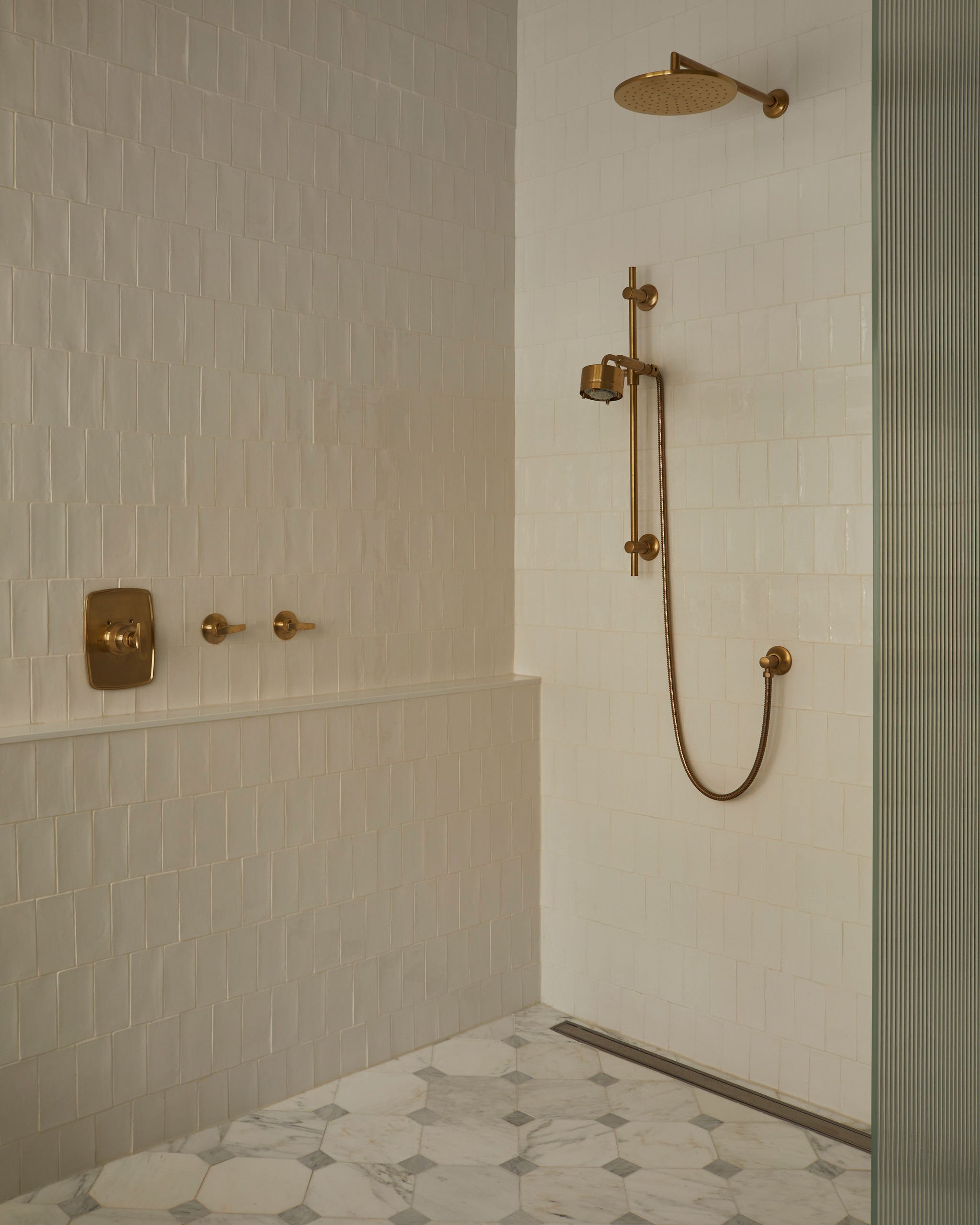
Photo: Niamh Barry
Brass fixtures and a linear drain in the wet room, with controls set outside the stream of water.
The Reeded Glass
The water closet needed a door - but a solid door felt heavy and closed-off in a space we were trying to keep bright and airy. Our suggestion was reeded glass: privacy without visual weight, and a detail that tied directly back to the ribbed face frames on the vanity cabinetry, creating a thread of texture running through the whole room.
Our client needed some convincing. She came around completely - and it became one of her favourite details in the finished space.
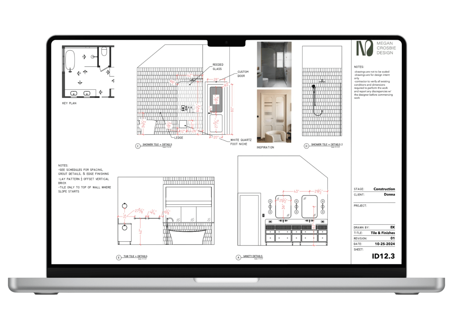
The construction detail for the reeded glass and custom door, tying the water closet back to the vanity's ribbed drawer fronts.
The Vanity
The vanity is where the details really live in this bathroom.
A Carrara marble top - classic, timeless, and the right stone for a space that needed to feel elevated without feeling cold
Furniture-style legs rather than a toe kick, which lifts the piece and gives the vanity a quality that a standard built-in doesn't have
Ribbed face frame shaker drawers that tie back to the reeded glass and add texture without noise
A dummy knob detail for visual balance
The storage decisions are what make this vanity genuinely functional:
A dedicated hair tool drawer - deep enough to fit everything, positioned where it actually gets used
Cleaning supplies integrated into the cabinetry so nothing lives on the counter or under the sink in a chaotic pile
Medicine cabinet mirrors that disappear into the wall
The counter stays clear because the storage was designed to hold everything.
Photo: Niamh Barry
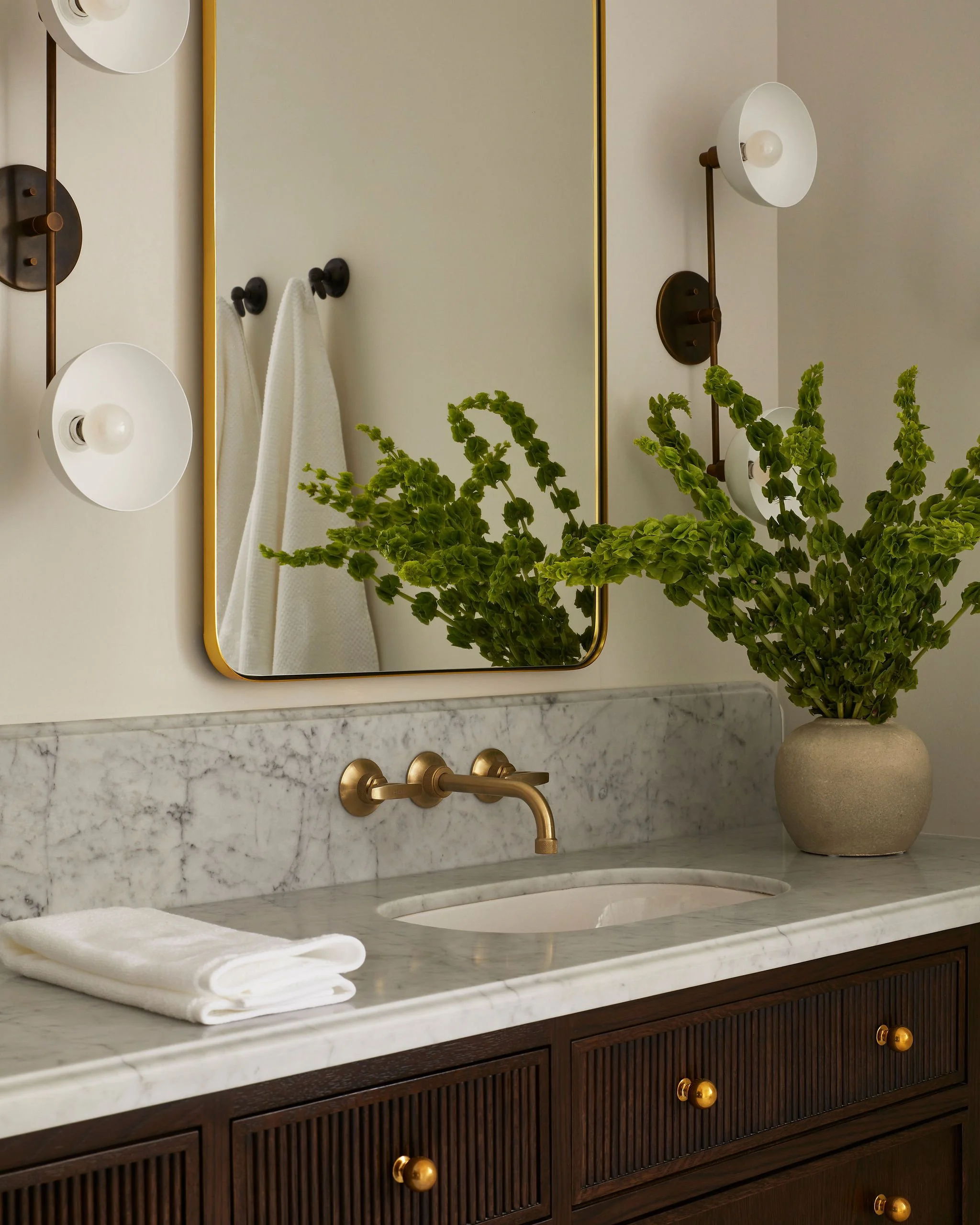
Photo: Niamh Barry
Carrara marble, brass fixtures, and the ribbed face frame drawers up close.
The Closet
This was the detail our client cared most about - and one we wanted to make sure we got right.
The brief was specific:
Fully open, no doors
Colour coded
Organized like a boutique
She wanted to see her collection. She wanted it laid out to suit exactly how she shops her own wardrobe:
Shoe shelves at the right height
Purses displayed
Plenty of hanging in the right ratios of full-length and double hang
No adjustable shelf hardware visible. Clean, sleek, and genuinely beautiful.
We designed the peninsula with drawers facing the closet for accessories and everyday items, and used the long wall at full depth to maximize hanging. The layout was mapped entirely around how she actually uses the space - not a generic closet template applied to her things, but a system built around her specific collection and her specific habits.
When she saw it, she said: "you listened to me very well."
What she meant, we think, was that we had included details she hadn't explicitly asked for - details that came from paying close attention to how she described her life in that space, and designing for it. That is the version of this work we are always trying to do.
The Takeaway
The most meaningful details in a primary ensuite are almost always the ones nobody else notices:
The drain placement
The control position
The drawer that holds exactly what it needs to hold
The door that provides privacy without making the room feel smaller
When a client is specific about what she wants and trusts the process enough to let the details be resolved properly, this is what's possible. Classic, elegant, bright, and airy - and designed around two people without either of them having to compromise.
Megan Crosbie Design is a boutique full-service residential interior design studio based in Toronto, with projects featured in Architectural Digest, Toronto Life, Style at Home, Refinery29, and The Spruce.
If you're considering a renovation in Toronto, Muskoka, or across Ontario - or thinking about what one might look like in the next few years - we'd love to hear from you.
YOU MAY ALSO LIKE