
Unionville: The Kitchen
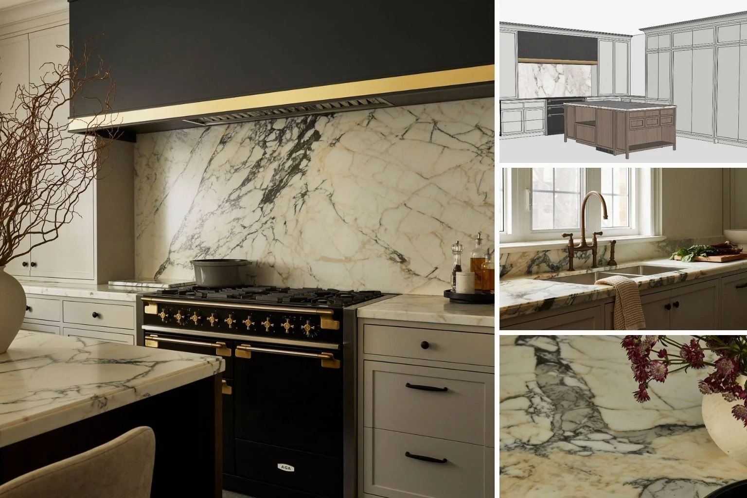
When our client approached us about renovating the hardest-working parts of a home she'd lived in for 25 years, the brief was refreshingly clear. She loves to entertain. She cooks serious meals for family and friends. And she wanted every inch of her kitchen to pull its weight — not just look beautiful, but actually function for the way she lives.
That kind of clarity is a gift at the start of a project. It means every decision has a reference point.
The Layout
The kitchen was generous in size, and we were working largely within the existing footprint — the bones were there, they just needed to be optimized. The general layout was working, but there was meaningful room for improvement in how the space was organized and experienced.
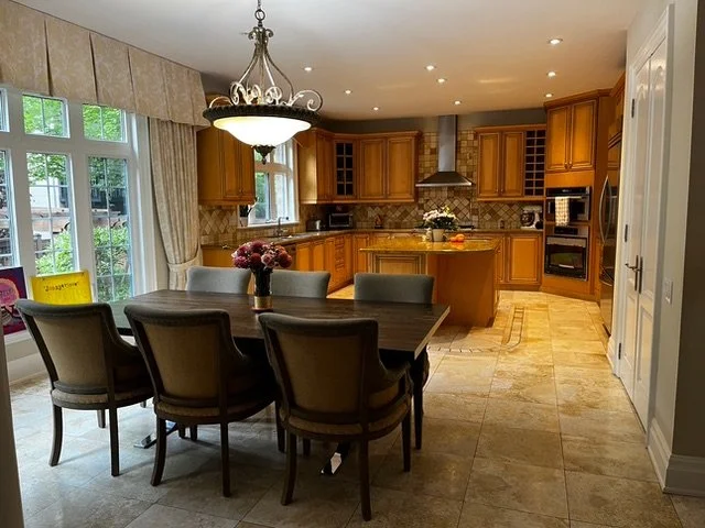
The kitchen before: solid bones, generous footprint, and 25 years of a layout that wasn't working as hard as it could.
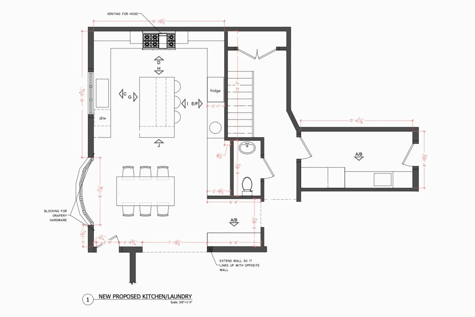
The proposed plan — same footprint, reorganized so every zone has a job.
We reimagined the pantry so that it stopped being a catch-all and became a system — separate cabinets, each with a designated category, labelled as part of our standard process so that everything has a home and the logic of the space is immediately legible.
The island became our first major focal point from early in the design process — conceived almost as a furniture piece rather than a built-in, anchored by a statement light fixture that we knew from the beginning would be the centrepiece of the room.
The range wall became the second focal point, organized around a custom hood vent that centres the whole composition.
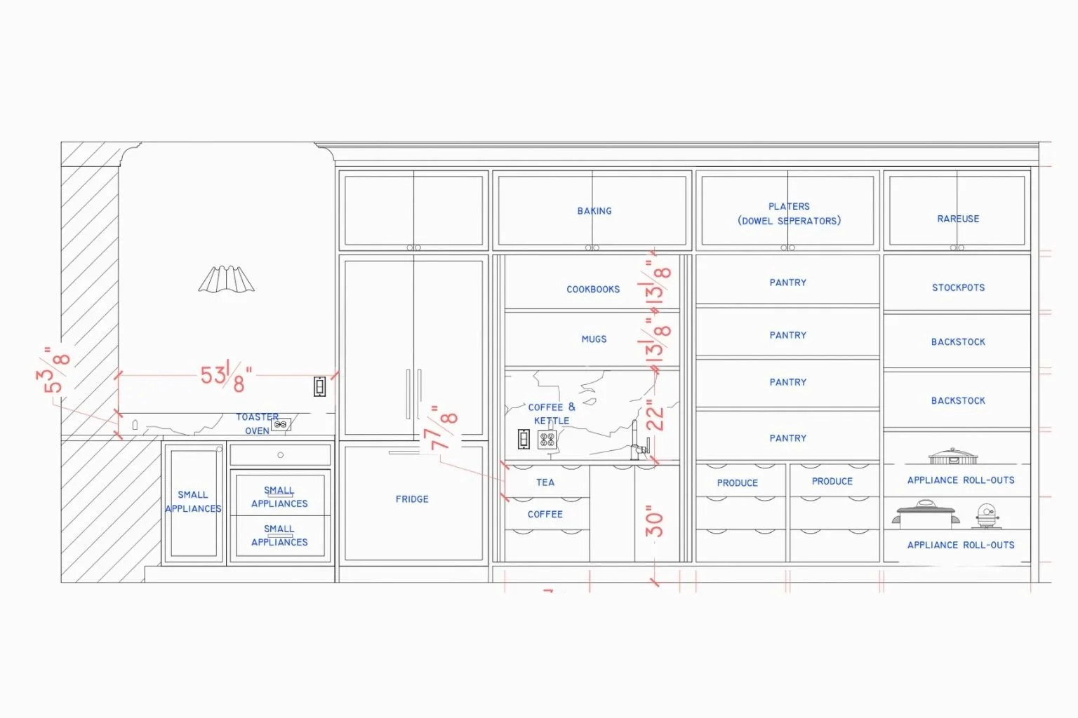
Every cabinet with a designated category — the pantry as a system, not a catch-all.
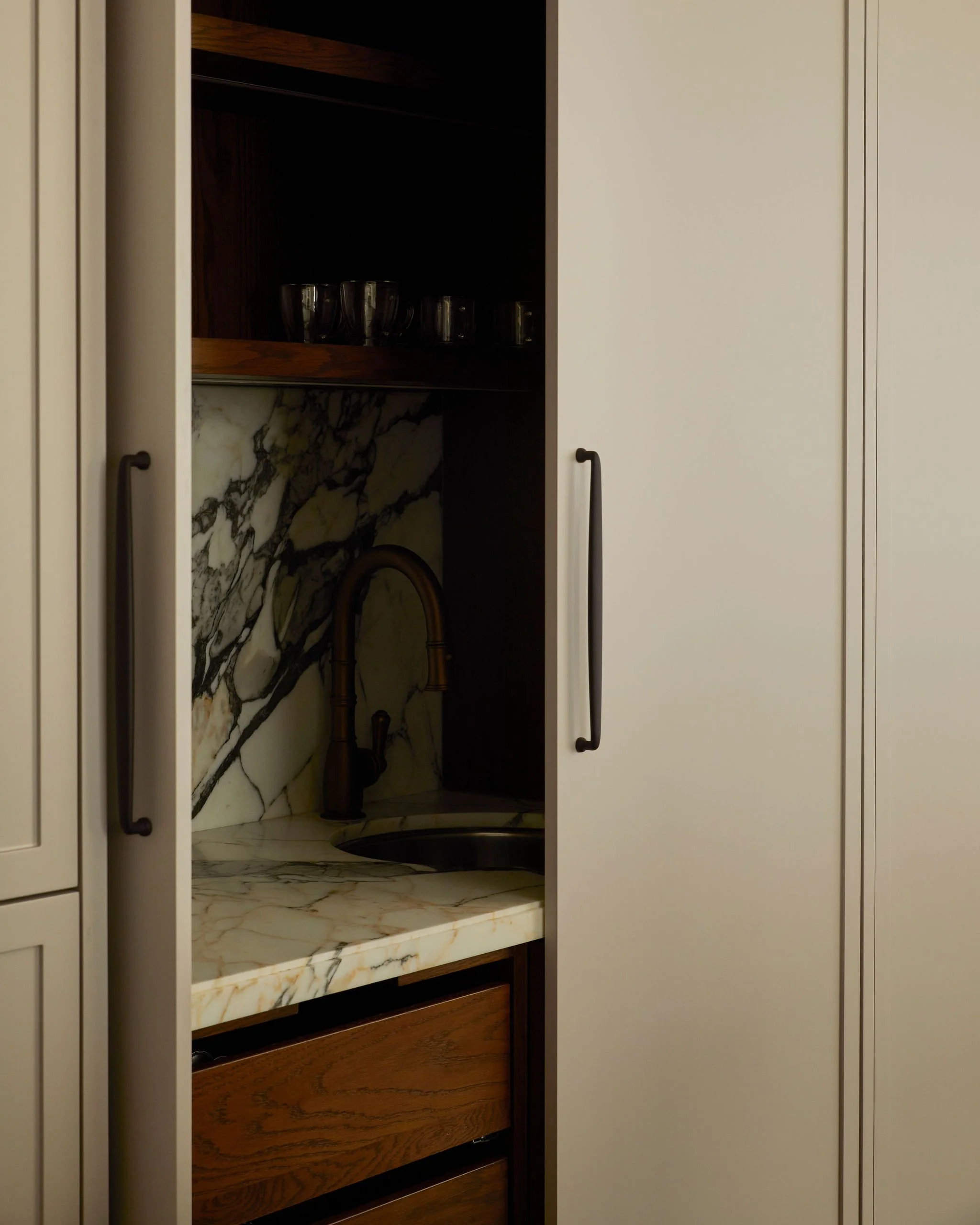
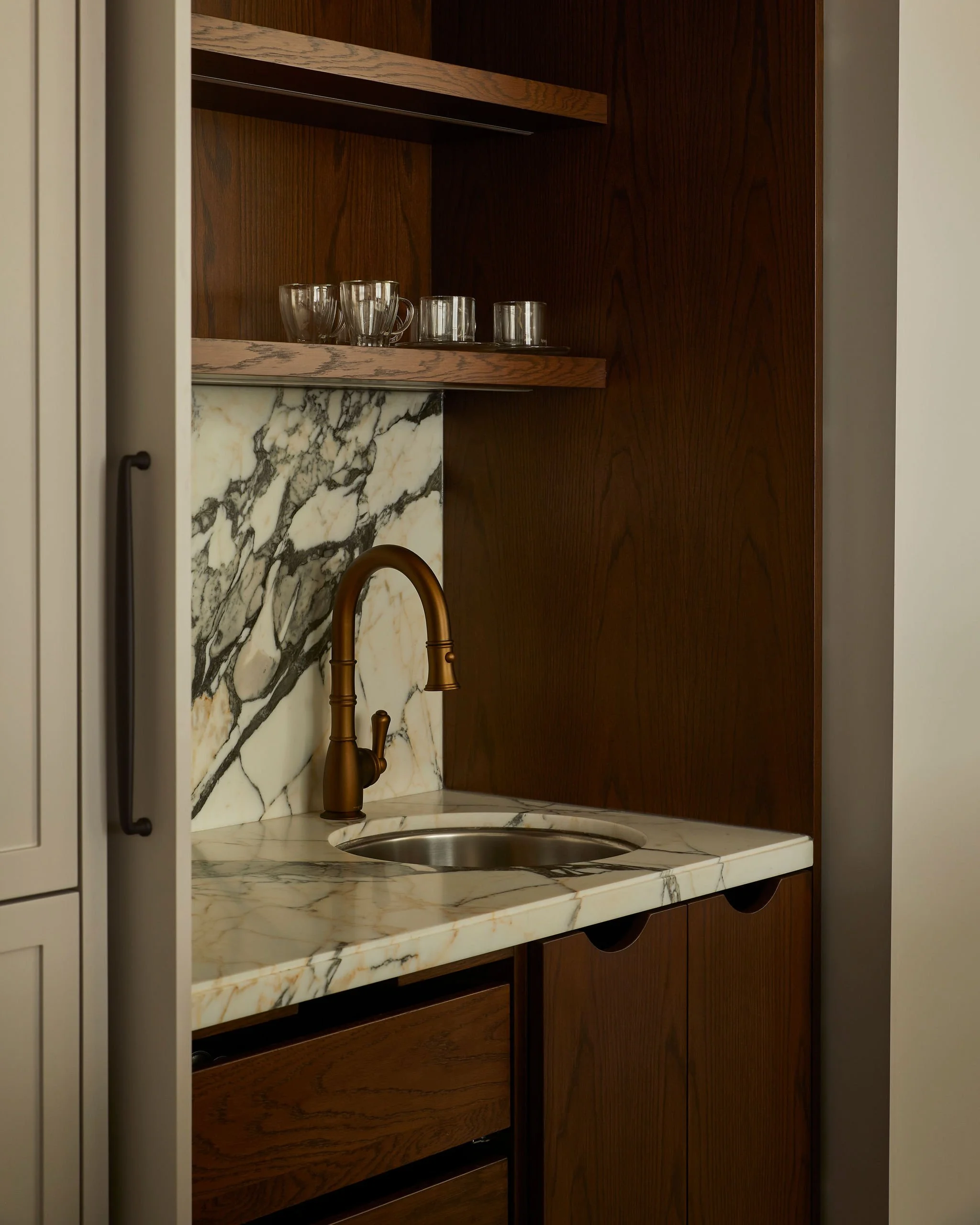
One detail that informed the design from day one: one of our client's daughters has accessibility needs, so we designed a dedicated coffee bar at a lowered counter height so she could reach everything comfortably and independently. Tucked behind pocketing pantry doors, it disappears when not in use — functional, considered, and completely seamless in the finished space.
The Design Decisions That Defined the Space
Our goal was to take this kitchen from suburban to genuinely elegant — adding depth, richness, and a sense of permanence that would make it feel less like a renovation and more like it had always been this way.
The deep wood island was the starting point for that feeling. It brings warmth and character to a space that could easily have read as cold or generic, and it grounds the room in a way that painted cabinetry alone never could. We balanced it against a creamy surround — enough contrast to feel intentional, not so much that it competes.
For the countertops, we selected a Picasso marble — a stone with extraordinary movement, pulling warm and cool tones through in equal measure.
Natural stone has a life to it that no engineered surface can replicate, and that was exactly the point. There are real maintenance conversations that come with marble, and we had them honestly. Our client decided the upkeep was worth the result — and we agreed.
Everything in this space was chosen to feel real: the wood island, the limestone floors, the stone counters. When materials are genuine, real life can go on without the anxiety of maintaining something that was never meant to be lived in.
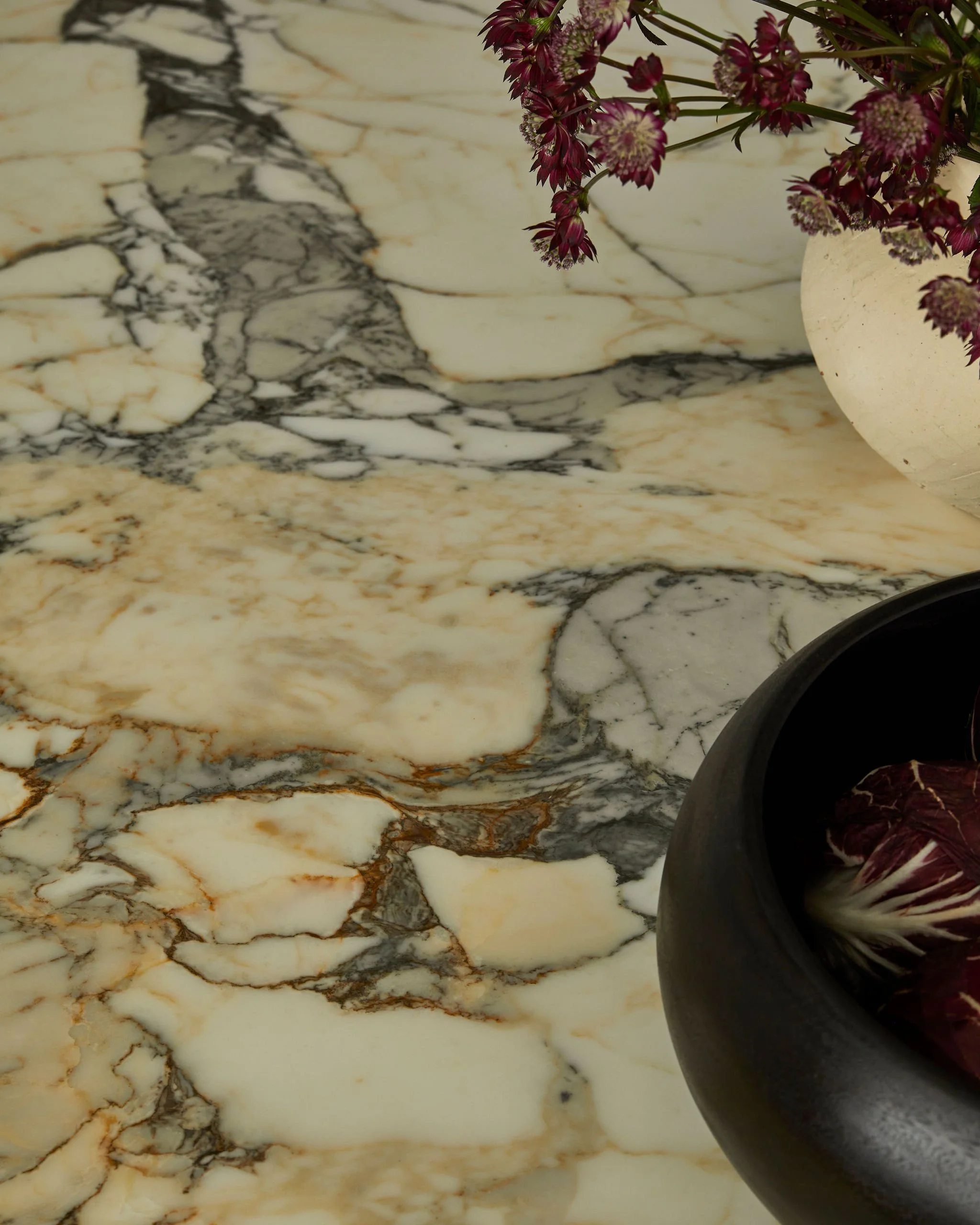
Picasso marble, up close — warm and cool tones pulling through in equal measure.
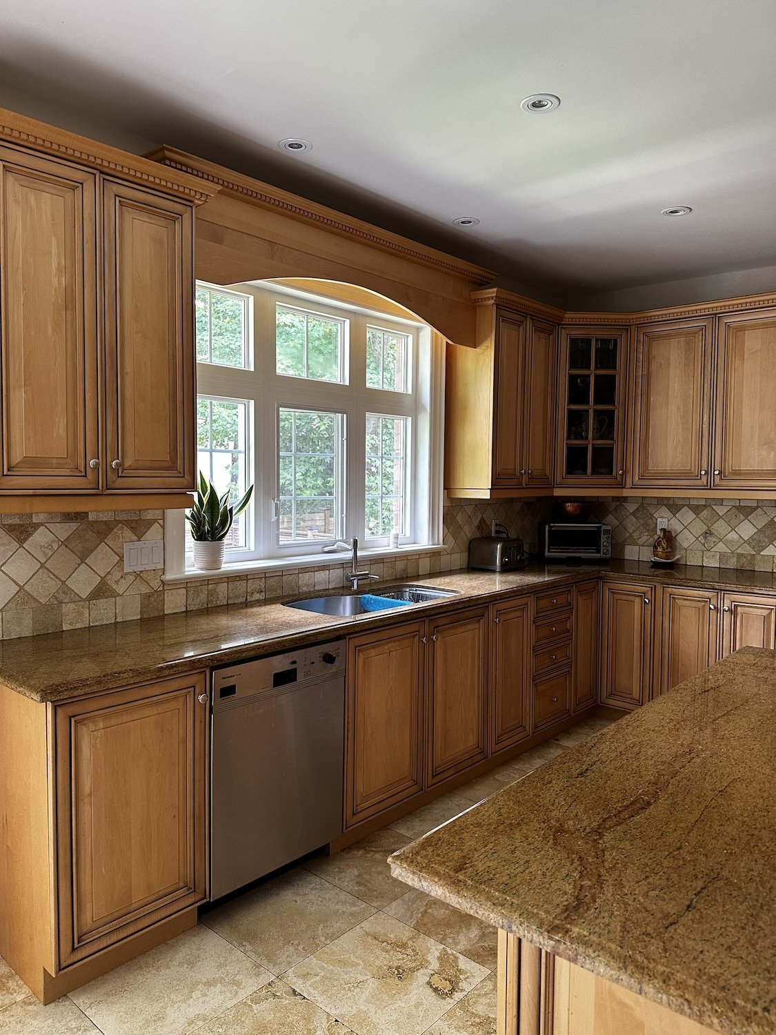
The sink wall before — same window, very different story.
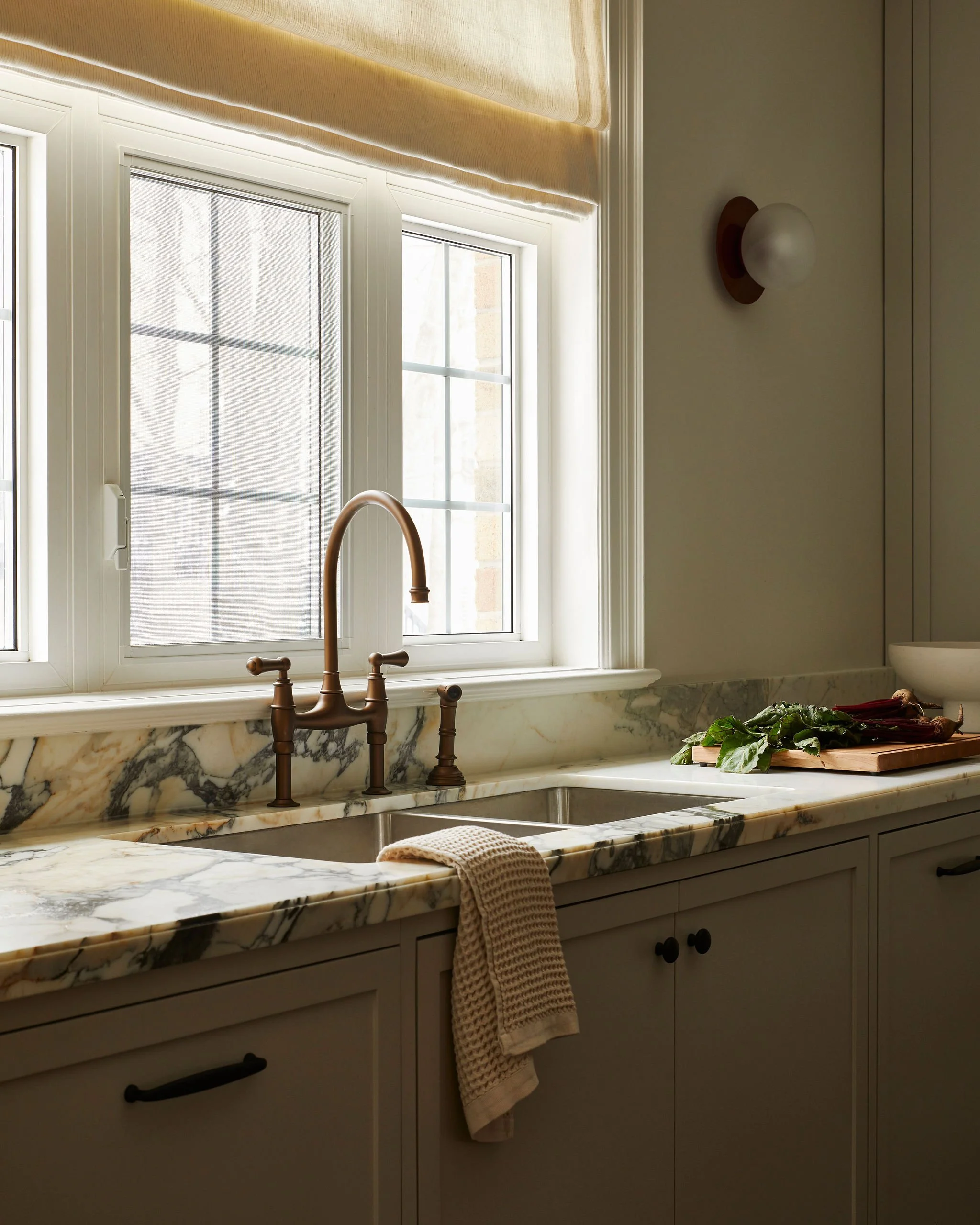
The same view now: Picasso marble, an english bronze bridge faucet, and cabinetry that lets the stone lead.
The limestone floor tile is one of those decisions that operates quietly in the background — an old-world undercurrent that you might not consciously notice, but that grounds the whole space and gives it a depth that a more predictable tile choice never would have.
The custom hood vent centres the range wall and the kitchen as a whole. The hit of black it introduces creates exactly the right balance against our metal finishes — enough contrast to feel deliberate, enough restraint to let everything else breathe.
The Light Fixture Moment
Some decisions in a project are straightforward. And then there are the ones that require a little convincing.
The island pendant — a quad fixture from one of our favourite lighting designers (Urban Electric) — was always the centrepiece of this room in our minds. From the first time we pulled it, we knew nothing else would do. It has the scale, the presence, and the warmth that a kitchen like this demands. But it was also a meaningful investment, and when we presented it our client's response was immediate and perfectly delivered:
"You're killing me. I won't be able to buy clothes for three months."
She sat with it. And then she said yes.
It was the right call. The space would not be the same with something else — and she trusted us. Paired with a series of sconces integrated throughout the kitchen, the lighting in this room does what good lighting always should: it creates atmosphere, not just illumination. The sconces in particular are what give the kitchen its charm after dark — that warm, layered glow that makes a functional room feel like somewhere you actually want to stay.
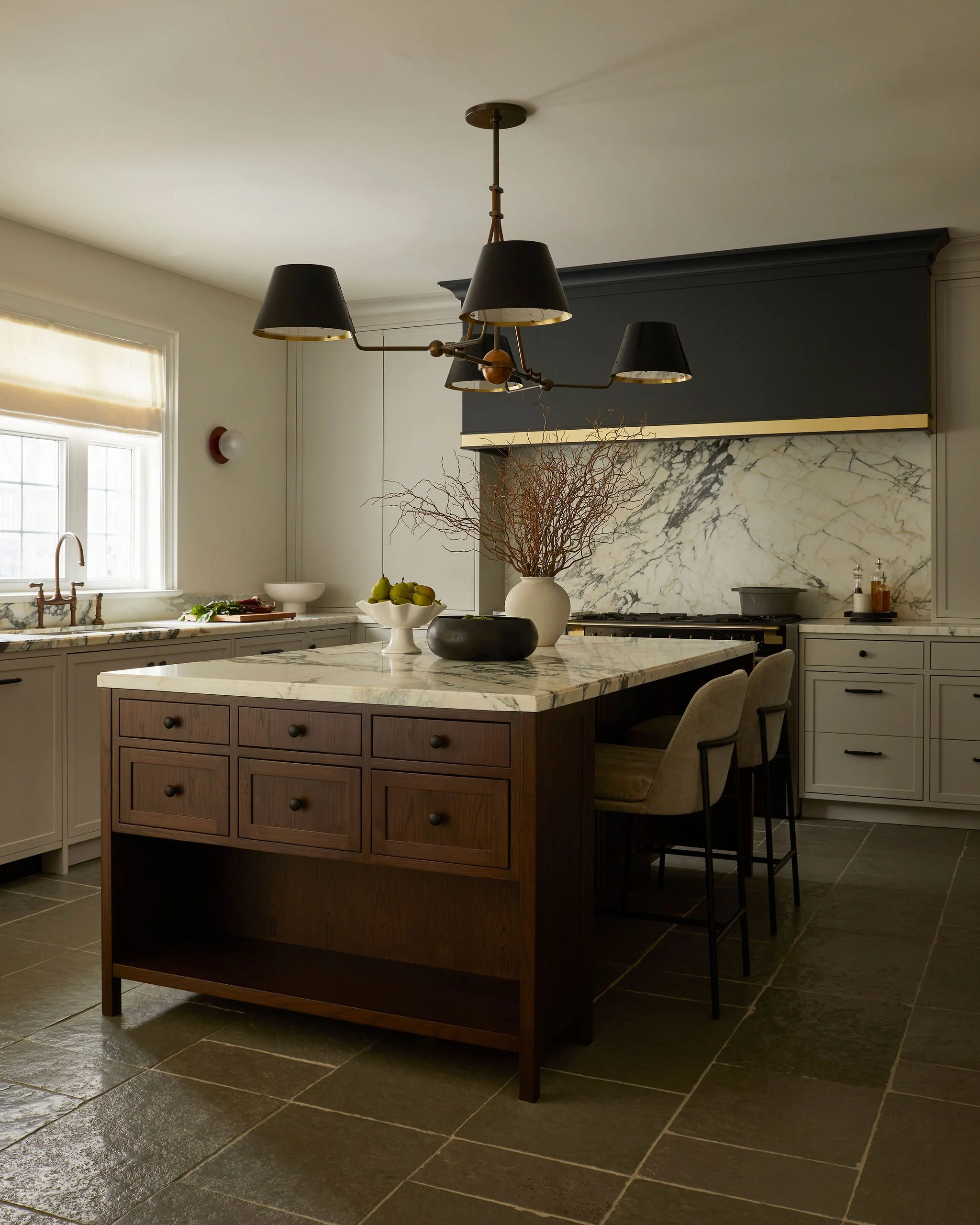
The quad pendant from Urban Electric — the piece worth three months of no clothes shopping : )
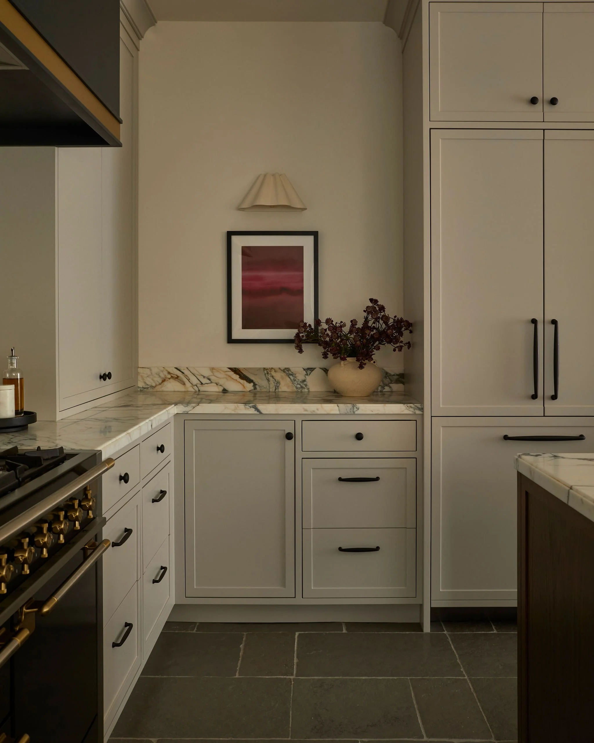
A scalloped sconce doing quiet work in the corner — the layered glow that makes the kitchen after dark.
The Result
This project is a near-perfect example of what happens when a client is clear about how she lives, specific about what she needs, and then trusts the process entirely. She told us exactly how she used the space, what she needed to store, and what mattered most — and then she let go. That kind of collaboration is what allows a kitchen to become something genuinely aspirational without losing any of its practicality.
Functional and beautiful are not in tension here. They are the same thing.
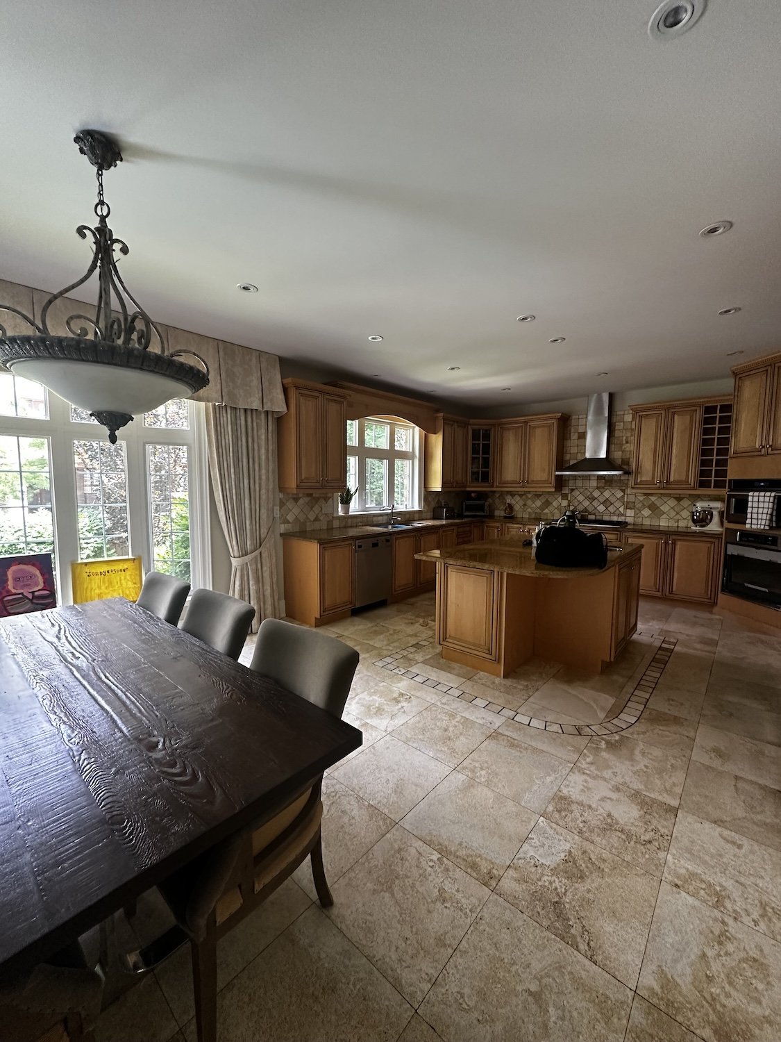
Where we started — a kitchen that had served 25 years and was ready for its next chapter.
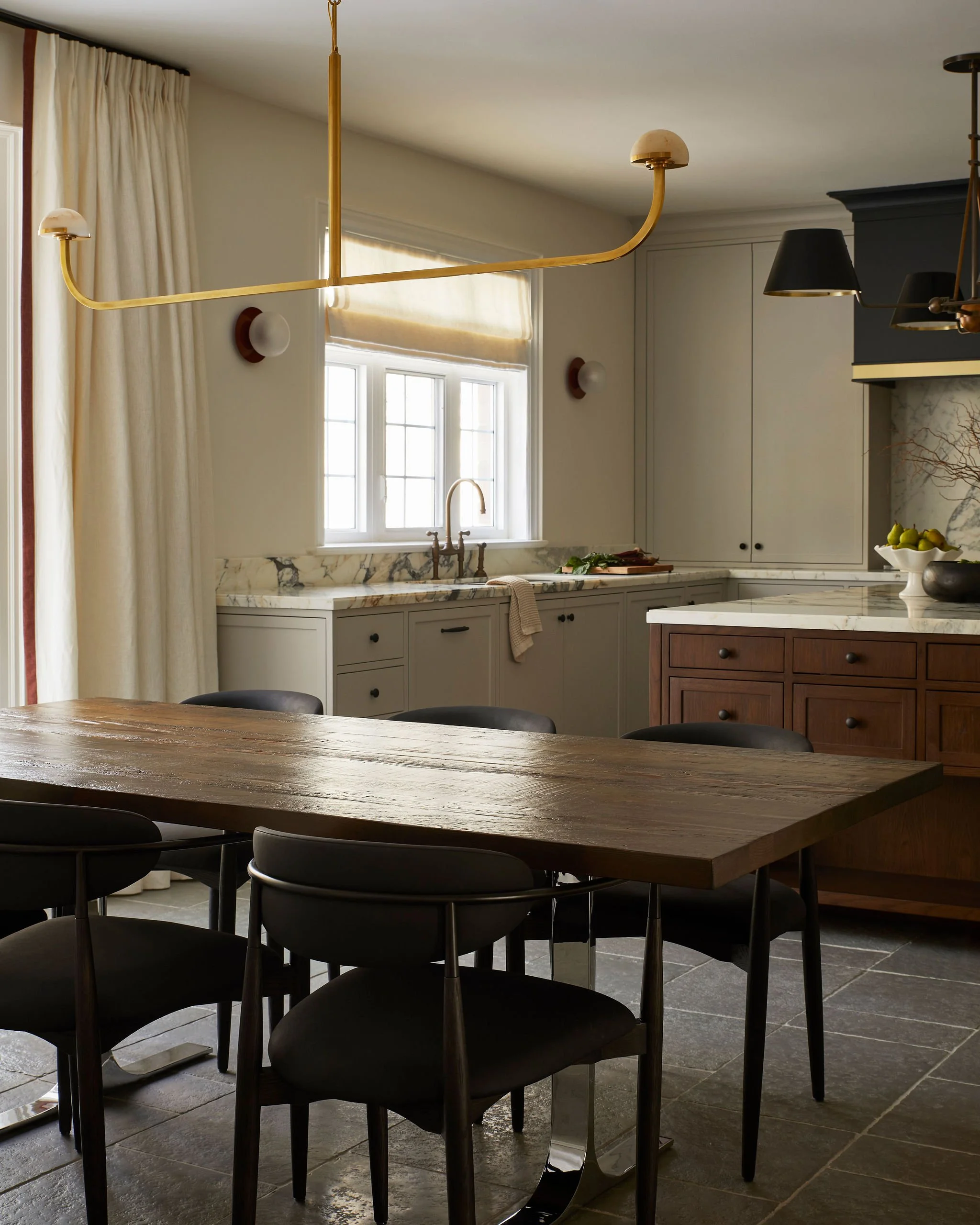
Where we ended up — same footprint, same view of the table, and a room that finally pulls its weight.
Megan Crosbie Design is a boutique full-service residential interior design studio based in Toronto, with projects featured in Architectural Digest, Toronto Life, Style at Home, Refinery29, and The Spruce.
If you're considering a renovation in Toronto, Muskoka, or across Ontario — or thinking about what one might look like in the next few years — we'd love to hear from you.
YOU MAY ALSO LIKE

In this post, we answer the most common (and critical) questions clients ask us before they begin a major renovation - from realistic budgeting to timelines, scope, and decision-making.